What
Brand Activation
Tool
Figma, C4D, AE
Timeline
10 Weeks
The goal
Gifting shoppers an experience to find their perfect match
PROBLEM
Even great brands have bad kiosks
There's not a day where shoppers don't interact with a kiosk of some kind and experience a confusing integration of a brand and design system.
Simultaneously shaped by the hesitation of eyewear shopping and the question of "what fits me best?" I designed an in-store kiosk that helps users find frames aligned with their face.
The project overall asks how can a kiosk create clear choices, represent the brand, and support purchase decisions.


Unblurring
Gentle Monster
GM has unique and avant-garde concepts/products. Their stores blur the lines between interaction and retail
key points in the experience
Scan -> Glasses -> Checkout
Sharing key clips of the main flow and summarizing design decisions
Scanning the face
The kiosk will share information about your face and why it's a good fit, and why it potentially could not work as well.
Trying it on
The kiosk will share information about your face and why it's a good fit, and why it potentially could not work as well.
Adding a prescription
The kiosk will share information about your face and why it's a good fit, and why it potentially could not work as well.
Checkout
The kiosk will share information about your face and why it's a good fit, and why it potentially could not work as well.
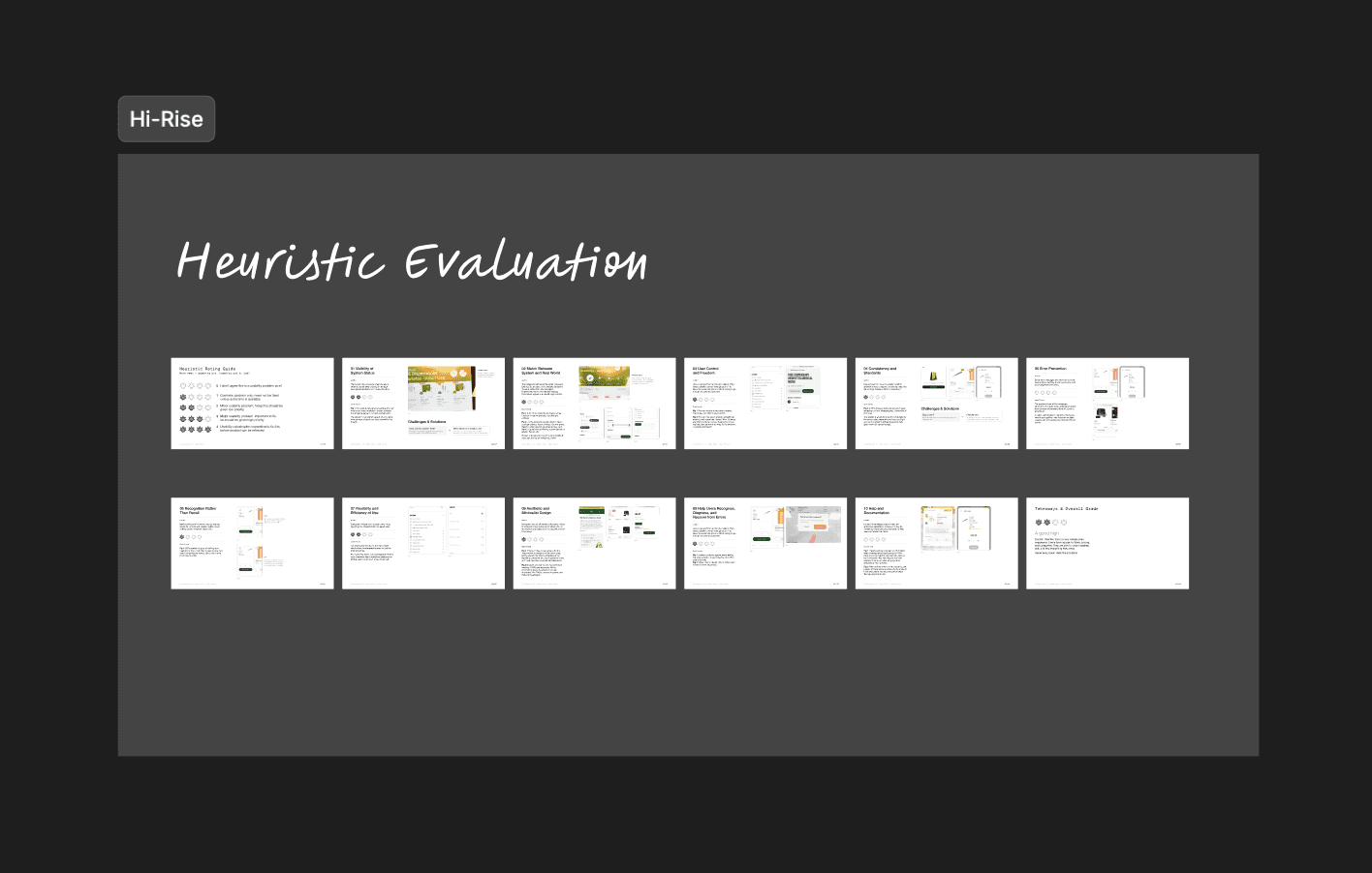
general kiosk Ux RESARCH + HEURISTICS
Clarity from asking questions
I went out in search of what makes kiosks so frustrating to users by testing the heuristics of 2 kiosks and interviewing GenZ peers (the group most familiar with kiosks)
Hi Rise Dispensary kiosk
Organization and Introducing new information
Studying the structure of information and educational text was in categories that were clear and concise
Taichi Boba kiosk
Customization options
Viewing customization steps for what works and what definitely doesn't!
THE KEY PROBLEM
Navigation is inconsistent + difficult and range of motion is tiring
Gap 1
Submenus
In complex product menus, scrolls and hidden submenus created cognitive friction.
Gap 2
Menu placement
Inconsistent menu placement popped up frequently, and often too high to be in good click zone
Gap 3
Full range motion
The kiosks needed full range of motion, which got tiring fast
THE SOLUTION
Provide simple menus and large margins, centering the experience
PEER INTERVIEWS
I asked 12 peers for their friction points
To understand, I talked to people why they hate kiosks, what’s confusing, and how they feel about ordering in person vs. ordering on a kiosk. Here's what I found:
OPPORUNITY
Try more and wait less
With growing popularity, Gentle Monster is creating queued lines stretching outside the storefront.
Crowded walls make trying on glasses challenging, introducing the opportunity for a second try-on path that both enhances user delight and brand efficiency.


typical users
Young, trendy, and self aware
Most of Gentle Monster's demographic are young people who are familiar with technology and care deeply about aesthetics and visuals. It was important to make everything feel smooth and gentle :D
USER JOURNEY
I created a comprehensive flow for product view, checkout, create account, prescription, and a few others.
I designed the main flow with first-time users in mind, introducing them to the key features while having it feel simple and manageable, and kept close to a few set goals to keep the result intentional.

BRAND CONSIDERATIONS
I memorized Gentle Monster's website, visited a location, and created a 50+ page doc of my findings.
I researched and counted every Gentle Monster product on top of flooding my feed and visiting a Gentle Monster location to really understand their brand system, marketing, and target users.
The kiosk is
An avenue to get new prescriptions
Gentle Monster glasses come with plastic lenses, requiring a second trip to fill them. Why not provide in-house lens cutting like other Korean stores?
The kiosk isn’t
A full prescription service
The kiosk will not measure prescriptions but provide an avenue for it. The ability to measure prescriptions and users ability to input are contradictory.
the kiosk
Mixing 3D, Figma prototyping, and a little AI to design an example
After doing loads of research, it was finally time to pull everything together!
glasses
Modelling glasses in C4D
Luckily, Gentle Monster has beautiful side and front shots of each and every product so I was able to replicate everything within C4D pretty accurately
Kiosk
From sketches and models to a C4D test
I created 3 different heights for the kiosks based on mirror height recommendations for short, middle, and tall people! Once sketches were set, I made a version in C4D
GM Scepter
Taking inspiration from Gentle Monster's 2024 Jewelry collection
I wanted the kiosk and scepter to fit within an existing collection of Gentle Monster, and chose the 2024 drop for its virality and beauty
KIOSK TESTING AND RENDERING
Real life measurements
The kiosk width is roughly 22 inches wide, with 3 different levels based on the 3 most common vanity mirror heights to account for size.
The aspect ratio in digital is 2048 x 1080 for the large kiosk, and 1920x1080 for the small kiosk.
thank you for shopping with us
Combining different skillsets
A lot of different components went into this project - from 3D design, to animations/motion, to wireframes, research, and studies! It was fun being able to make all the small pieces come together into a final work.
and yet…
While this idea isn’t new, this was an exploration of problem solving kiosk designs, and integrating it into a luxury experience. Turning a necessity into an art installation was very exciting!